ANDRES TRUUS

Kas sina, EP2027 peakorraldaja Ave Nukki, lihtsalt armusid sellesse logosse esimesest silmapilgust või oli konkurss lihtsalt liiga suur oht, et keegi pakub midagi veel paremat?
Oht oli tegelikult olematu – mul oli lihtsalt kiiresti midagi vaja ja muuseas mainisin Andresele: „Tee miskit… aga tee nii, et saaksime värve muuta.“  Ja Andres saatis mulle midagi millesse mina armusin

Oleme küll sini-must-valged, aga kõik ei pea ju kogu aeg sini-must-valge olema. Ma ise eelistan pigem tagasihoidlikumaid logosid, aga no 100 aastat on ikkagi 100 aastat – nii pikka ajalugu ei saa päris väikese tagasihoidliku täpiga ära tähistada.
Ja need sümbolid, mis logosse said, on minu jaoks väga ilusalt Eesti ja Austraalia ühine lugu. Ainult Ooperimaja ja number 100 oleks kuidagi liiga lihtne olnud – umbes nagu „Jah, me oleme Austraalias ja… meil on 100.”
Aitähh Andres!
Did you the EP2027 organiser Ave Nukki simply fall in love with the logo at first sight, or was a competition simply too much of a risk that someone might come up with something even better?
The risk was actually non-existent – I simply needed something quickly, and I casually said to Andres: “Make something… but make it so that we can change the colours.” And Andres sent me something that I fell in love with.
We may be blue, black and white, but not everything has to be blue, black and white all the time. Personally, I prefer more understated logos, but 100 years is still 100 years – you simply cannot celebrate such a long history with a tiny, modest dot.
And the symbols that made it into the logo, for me, tell the shared story of Estonia and Australia very beautifully. Having only the Opera House and the number 100 would have been somehow too simple – something like, “Yes, we are in Australia and… we have 100.”
Thank you, Andres!
Kas EP2027 logo idee sündis geniaalsest inspiratsioonist, kolmandast kohvist või lihtsalt „teeme midagi ägedat“ hetkest?
Peab tunnistama, et logo sündis kiiresti ning juba esimene kavand jõudis peakorraldaja Ave lauale lihtsalt väikese ettepanekuna. See on üsnagi ebatavaline, sest tavaliselt kulub huvitava lahenduseni jõudmiseks märksa rohkem kohvi ja kätekõverdusi. EP27 logo tahtis aga justkui ise päevavalgele ilmuda. Küllap oli siin tegu kõigi kolme asjaolu kombinatsiooniga, millele lisandusid veel tegemise rõõm ja vabadus.
Kui palju Eesti ja Austraalia ajalugu mahub ühte EP2027 logosse – ja kas sa said sellest aru enne või pärast seda, kui Sulle öeldi „tee miskit“?
Eks ikka sama palju, kui häid lambaid ühte lauta mahub, nagu vanad eestlased armastasid öelda. Kuid tegelikult – Austraalia on olnud asustatud vähemalt 50 000 aastat, Eesti ala aga peaaegu 11 000 aastat – kohe pärast viimase jääaja lõppu. Seega on mõlema maa esiajalugu pikk ning vanimatest kultuurikihtidest on meieni jõudnud iidseid märgisüsteeme ja tähendusi. Austraalia aborigeenide ja Eesti esivanemate maailmapildis leidub palju sarnast. See kinnitab veel kord, et inimestena oleme kõik üks ja seesama. Valik huvitavamatest märkidest on ka EP27 logosse kenasti ära mahtunud ning nende tähenduste kohta saab lähemalt lugeda, klõpsates esilehel olevale logole.
Kui EP2027 logo saaks ise valida, kas ta tahaks olla tagasihoidlik ja minimalistlik või öelda uhkelt: „Kuulge, meil on siin 100 aastat ajalugu – ma pean ikka natuke lärmi tegema!“?
Absoluutselt! Oleme uhked oma väikese, kuid armsa ja nutika rahva üle. 100 aastat järjepidevat tegevust, veel teisel pool maakera Sydney’s ning omas majas, on igati erakordne saavutus. Ja seda tuleks tähistada täpselt nii, nagu meie esivanemad oleks seda teinud – laulu, tantsu ning koostegemise rõõmuga.
Did the idea for the EP2027 logo come from a stroke of genius, a third coffee, or simply one of those “let’s make something cool” moments?
I have to admit that the logo came together quickly, and the very first draft reached the organiser Ave’s desk simply as a small suggestion. That is quite unusual, because normally it takes considerably more coffee and push-ups to arrive at an interesting solution. But the EP27 logo seemed to want to appear all by itself. I suppose it was a combination of all three things, with the joy of creating and a sense of freedom added to the mix.
How much Estonian and Australian history can fit into one EP2027 logo – and did you realise all of this before or after you were told “just make something”?
Well, about as much as good sheep can fit into one sheepfold, as the old Estonians liked to say. But actually – Australia has been inhabited for at least 50,000 years, while the territory of Estonia has been inhabited for almost 11,000 years – ever since the end of the last Ice Age. So the prehistory of both countries is long, and ancient systems of symbols and meanings have survived from the oldest cultural layers. There are many similarities in the worldviews of Australian Aboriginal peoples and the ancestors of Estonians. This confirms once again that, as human beings, we are all one and the same. A selection of the more interesting symbols has also fitted nicely into the EP27 logo, and you can read more about their meanings by clicking on the logo on the homepage.
If the EP2027 logo could choose for itself, would it want to be modest and minimalist, or proudly say: “Listen, we have 100 years of history here – I really need to make a bit of noise!”?
Absolutely! We are proud of our small, but lovely and clever nation. One hundred years of continuous activity, on the other side of the world in Sydney, and in our own building, is quite an extraordinary achievement. And that should be celebrated exactly as our ancestors would have done – with singing, dancing and the joy of doing things together.
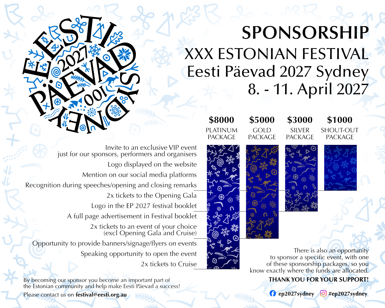
Kui sa soovid meie festivali toetada, anna meile sellest teada
Võta meiega ühendust: festival@eesti.org.au
If you would like to support our festival, please let us know.
Get in touch at festival@eesti.org.au